
Search for answers or browse our Knowledge Base.
Guides | Models | Validation | Book
-
Guides
-
-
- How to Select the Right Ground Plane Model
- New Tools in AN-SOF: Selecting and Editing Wires in Bulk
- How to Speed Up Simulations in AN-SOF: Tips for Faster Results
- Enhancing Antenna Design Flexibility: Project Merging in AN-SOF
- AN-SOF Antenna Simulation Best Practices: Checking and Correcting Model Errors
- How to Adjust the Radiation Pattern Reference Point for Better Visualization
-
- Modeling Lumped Loads in AN-SOF: Canceling Feedpoint Reactance for a Perfect Match
- Can AI Design Antennas? Lessons from a 3-Iteration Yagi-Uda Experiment
- Modeling Common-Mode Currents in Coaxial Cables: A Hybrid Approach
- Beyond Analytical Formulas: Accurate Coil Inductance Calculation with AN-SOF
- Complete Workflow: Modeling, Feeding, and Tuning a 20m Band Dipole Antenna
- DIY Helix High Gain Directional Antenna: From Simulation to 3D Printing
- Design Guidelines for Skeleton Slot Antennas: A Simulation-Driven Approach
- Linking Log-Periodic Antenna Elements Using Transmission Lines
- AN-SOF Mastery: Adding Elevated Radials Quickly
- Fast Modeling of a Monopole Supported by a Broadcast Tower
- RF Techniques: Implicit Modeling and Equivalent Circuits for Baluns
-
- Antenna Far-Field Comparison using Multi-Slice and Multi-Frequency Plots
- Understanding the Antenna Near Field: Key Concepts Every Ham Radio Operator Should Know
- Evaluating EMF Compliance - Part 1: A Guide to Far-Field RF Exposure Assessments
- Evaluating EMF Compliance - Part 2: Using Near-Field Calculations to Determine Exclusion Zones
- Wave Matching Coefficient: Defining the Practical Near-Far Field Boundary
- AN-SOF Data Export: A Guide to Streamlining Your Workflow
- Front-to-Rear and Front-to-Back Ratios: Applying Key Antenna Directivity Metrics
- Exporting Radiation Patterns to MSI Planet Format: A Step-by-Step Guide
- Exporting Radiation Patterns to Radio Mobile: A Step-by-Step Guide
- Generating Field Isocontours: Integrating AN-SOF with Scilab
-
-
-
- Introducing AN-SOF 11: Precision Modeling and Next-Gen Electromagnetic Simulation
- Introducing AN-SOF 10.5 – Smarter Tools, Faster Workflow, Greater Precision
- Introducing the AN-SOF Engine: Power, Speed, and Flexibility for Antenna Simulation
- What’s New in AN-SOF 10? Smarter Tools for RF Professionals and Antenna Enthusiasts
- To Our Valued AN-SOF Customers and Users: Reflections, Milestones, and Future Plans
- AN-SOF 9.50 Release: Streamlining Polarization, Geometry, and EMF Calculations
- AN-SOF 9: Taking Antenna Design Further with New Feeder and Tuner Calculators
- AN-SOF Antenna Simulation Software - Version 8.90 Release Notes
- AN-SOF 8.70: Enhancing Your Antenna Design Journey
- Introducing AN-SOF 8.50: Enhanced Antenna Design & Simulation Software
- Get Ready for the Next Level of Antenna Design: AN-SOF 8.50 is Coming Soon!
- Upgrade to AN-SOF 8.20 - Unleash Your Potential
- AN-SOF 8: Elevating Antenna Simulation to the Next Level
- Evolution of AN-SOF: New Features and Enhancements from Version 6.20 to 7.90
-
-
- Types of Wires
- Wire Attributes
- Wire Materials
- Enabling/Disabling Resistivity
- Enabling/Disabling Coating
- Cross-Section Equivalent Radius
- Exporting Wires
-
-
Models
-
- Download Example Models
- Explore 5 Antenna Models with Less Than 50 Segments in AN-SOF Trial Version
- Modeling a Center-Fed Cylindrical Antenna with AN-SOF
- Modeling a Circular Loop Antenna in AN-SOF: A Step-by-Step Guide
- Monopole Antennas Over Imperfect Ground: Modeling and Analysis with AN-SOF
- Modeling Helix Antennas in Axial Radiation Mode Using AN-SOF
- Step-by-Step: Modeling Basic Yagi-Uda Arrays for Beginners
-
- Modeling an Inverted V Antenna for 40 Meters: Design Insights and Ground Effects
- Modeling a Super J-Pole: A Look Inside a 5-Element Collinear Antenna
- The 5-in-1 J-Pole Antenna Solution for Multiband Communications
- Simulating a Multiband Omnidirectional Dipole Antenna Design
- Understanding the Folded Dipole: Structure, Impedance, and Simulation
- An Efficient Approach to Simulating Radiating Towers for Broadcasting Applications
- Design and Simulation of Short Top-Loaded Monopole Antennas for LF and MF Bands
-
- The Loop on Ground (LoG) Antenna: A Compact Solution for Directional Reception
- Precision Simulations with AN-SOF for Magnetic Loop Antennas
- Experimenting with Half-Wave Square Loops: Simulation and Practical Insights
- Radar Cross Section and Reception Characteristics of a Passive Loop Antenna: A Simulation Study
-
- Simulating Helical Antennas over Finite Wire-Grid Ground Planes
- Introduction to Yagi-Uda Arrays: Analyzing a 5-Element Beam with a Folded Dipole Driver
- Explicit Modeling of a 9-Element LPDA: Capturing Real-World Wideband Performance
- Exploring an HF Log-Periodic Sawtooth Array: Insights from Geometry to Simulation
- Boosting Performance with Dual V Antennas: A Practical Design and Simulation
-
- The Lazy-H Antenna: A 10-Meter Band Design Guide
- Extended Double Zepp (EDZ): A Phased Array Solution for Directional Antenna Applications
- Transmission Line Feeding in Antenna Design: Exploring the Four-Square Array
- Enhancing VHF Performance: The Dual Reflector Moxon Antenna for 145 MHz
- Building a Compact High-Performance UHF Array with AN-SOF: A 4-Element Biquad Design
- Building a Beam: Modeling a 5-Element 2m Band Quad Array
- A Closer Look at the HF Skeleton Slot Antenna
- The 17m Band 2-Element Delta Loop Beam: A Compact, High-Gain Antenna for DX Enthusiasts
- The Moxon-Yagi Dual-Band VHF/UHF Antenna for Superior Satellite Link Performance
-
- Rectangular Microstrip Patch Antennas: A Comparative Analysis of Transmission Line Theory and AN-SOF Numerical Results
- High-Performance Impedance Matching in Microstrip Antennas: The Role of Capacitive Feeding
- Simplified Modeling of Microstrip Antennas on Ungrounded Dielectric Substrates: A Practical First-Order Approach
- A Simple, Low-Cost Approach to Simulating Solid Wheel Antennas at 2.4 GHz
-
- Nelder-Mead Optimization for Antenna Design Using the AN-SOF Engine and Scilab
- Evolving Better Antennas: A Genetic Algorithm Optimizer Using AN-SOF and Scilab
- Building Effective Cost Functions for Antenna Optimization: Weighting, Normalization, and Trade-offs
- Element Spacing Simulation Script for Yagi-Uda Antennas
- Automating 2-Element Quad Array Design: Scripting and Bulk Processing in AN-SOF
-
-
Validation
-
- The AN-SOF Calculation Engine
- Electric Field Integral Equation
- The Exact Kernel
- The Method of Moments
- Excitation of the Structure
- Curved vs. Straight Segments
-
- Navigating the Numerical Landscape: Choosing the Right Antenna Simulation Method
- The 7 Limitations of Traditional MoM — and Why Measurement-Grade Conformal MoM Exists
- Beyond NEC: Accurate LF/MF Grounding with the James R. Wait Model
- Validating Numerical Methods: Transmission Line Theory and AN-SOF Modeling
- Circuit Theory Validation: Simulating an RLC Series Resonator
-
- Validation of a Panel RBS Antenna with Dipole Radiators against IEC 62232 Standard
- Linear Antenna Theory: Historical Approximations and Numerical Validation
- Simple Dual Band Vertical Dipole for the 2m and 70cm Bands
- Validating V Antennas: Directivity Analysis with AN-SOF
- Validating Dipole Antenna Simulations: A Comparative Study with King-Middleton
- Energy Conservation and Gain Convergence in Cylindrical Dipoles: A Numerical Validation Study
- Numerical Convergence and Stability of Input Impedance in Cylindrical Dipoles
- Advanced Modeling of Monopoles over Radial Wire Ground Screens
-
- Precision Modeling of Small Loop Antennas: Validating the Conformal Method of Moments (CMoM)
- Input Impedance and Directivity of Large Circular Loops: Theory vs. Numerical Simulation
- Helical Antennas in Normal Mode: Theoretical Limits and Numerical Validation
- Validating AN-SOF Simulations for Gain and VSWR of Helix Antennas in Axial Mode
-
-
Book
-
- 1.0 Preface & Table of Contents
- 1.1 Maxwell’s Equations and Electromagnetic Radiation
- 1.2 The Isotropic Radiator
- 1.3 Arrays of Point Sources
- 1.4 The Hertzian Dipole – FREE SAMPLE
- 1.5 The Short Dipole
- 1.6 The Half-Wave Dipole
- 1.7 Thin Dipoles of Arbitrary Length
- 1.8 Ground Plane and Image Theory
- 1.9 Monopole Antennas
- Lab 1: Radiation & Ideal Physics
-
- 2.1 Radiation Pattern Fundamentals
- 2.2 Polarization
- 2.3 Radiated Power and Energy Conservation
- 2.4 Radiation Resistance
- 2.5 Radiation Efficiency
- 2.6 Directivity and Gain
- 2.7 Beamwidth and Sidelobes
- 2.8 Feedpoint Impedance and Bandwidth
- 2.9 The Reciprocity Principle
- 2.10 Receiving Mode Operation
- 2.11 Effective Aperture and Gain
- 2.12 The Friis Transmission Equation
- Lab 2: Performance & Metrics
-
3D Plots
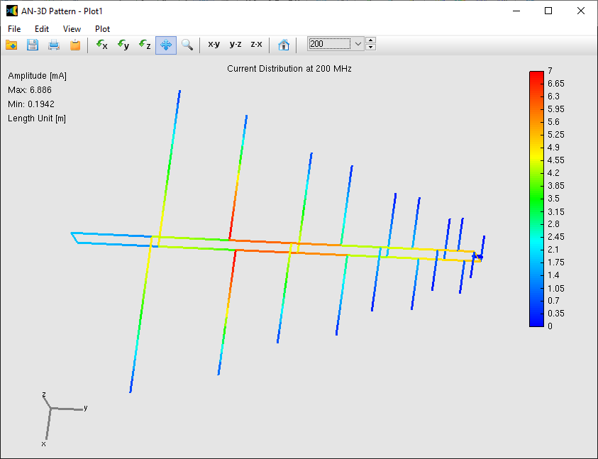
To visualize how current flows across your entire model, navigate to Results > Current Distribution 3D in the main menu. This command launches the AN-3D Pattern application, which renders the current amplitude directly on the 3D structure using a dynamic color scale (Fig. 1).
Beyond amplitude, you can also analyze the complex components of the current. By selecting the Plot menu within AN-3D Pattern, you can display:
- Amplitude
- Phase
- Real part
- Imaginary part
Adjusting the Color Bar in AN-3D Pattern
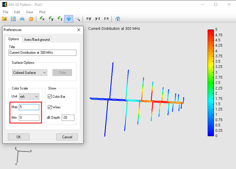
For precise data interpretation and professional presentations, you can manually override the automatic scaling. This allows you to set specific increments (e.g., multiples of 5).
- Navigate to Edit > Preferences in the AN-3D Pattern menu (Fig. 2).
- Manually define the Max and Min values of the color scale to highlight specific ranges of interest.
2D Plots
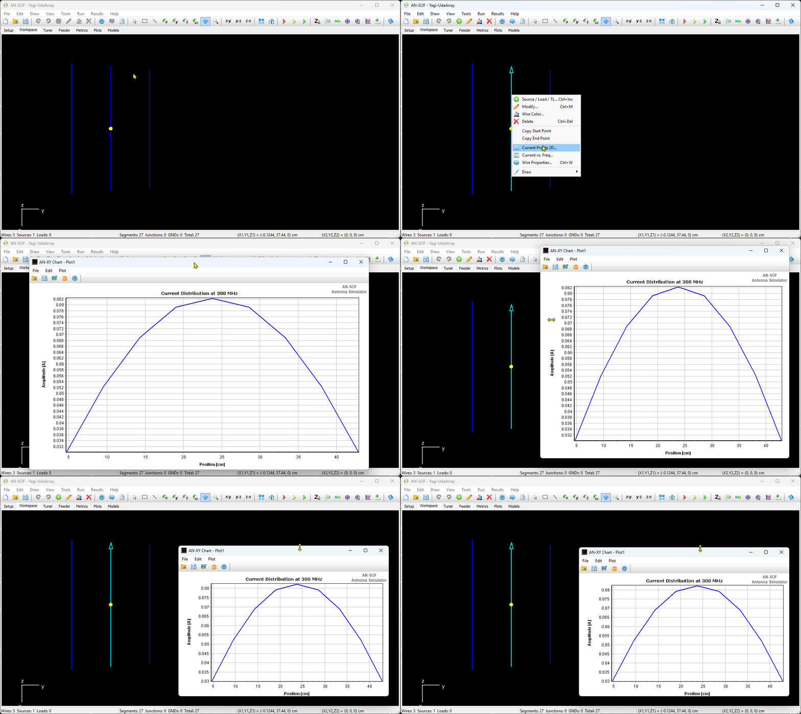
If you need to analyze the current along a specific wire in detail, you can generate a Cartesian plot using AN-XY Chart.
Method 1: Quick Access
Right-click directly on a wire in the workspace and select Current Profile 2D… from the pop-up menu (Fig. 3).
Method 2: Toolbar Selection
- Click the Pick Tool button (arrow icon) on the toolbar.
- Left-click the desired wire.
- Go to Results > Current Profile 2D… in the main menu.
Within the AN-XY Chart interface, you can toggle between amplitude, phase, and complex parts via the View menu.
💡 Tips
To optimize your analysis of 2D current distributions, AN-XY Chart provides several interactive navigation and data management features:
- Zooming: To focus on a specific area of the plot, press and hold the left mouse button while expanding a box over the desired region.
- Panning: To move the view without changing the zoom level, right-click on the graph and drag the mouse.
- Reset View: To quickly return to the original full-scale view, left-click and expand a small rectangle in an upward direction anywhere on the plot.
- Units and Scale: Go to Edit > Preferences (or click the gear icon on the toolbar) to change the units of plotted magnitudes or customize the scales and ranges of the horizontal and vertical axes.
- Data Export: Go to File > Export to export the raw plot data to a CSV or TXT file.